Understanding Poster Design Principles
Effective poster design hinges on a well-balanced integration of visual elements and textual clarity to communicate its message compellingly. By adhering to core design principles, creators ensure their posters attract attention, convey information efficiently, and leave a lasting impression on viewers. A thoughtful approach to layout, color schemes, typography, and imagery is essential to achieving these objectives.

Layout and Composition
Proper layout acts as the backbone of an effective poster, guiding the viewer’s eye smoothly from the headline to supporting visuals and information. A balanced composition ensures that no section feels overcrowded or neglected. Utilizing grids and alignment techniques helps organize content clearly, making the poster easy to read and visually appealing.
Color Scheme Selection
Color choices significantly impact a poster's visual impact and message delivery. Using contrasting colors can highlight key information, while harmonious palettes create a unified look. Bright, energetic schemes often attract attention in busy environments, whereas subtler tones are suitable for sophisticated or professional contexts.
Typography and Font Usage
Fonts play a crucial role in readability and tone. Selecting clear, legible typefaces for headlines, subheadings, and body text ensures the message is easily understood at a glance. Hierarchical typographic structures—through size, weight, and color variations—effectively direct the viewer’s focus where needed and organize content systematically.
Imagery and Graphics
High-quality visuals and graphics are instrumental in reinforcing the poster’s message. Striking images or icons should complement the textual content and not overwhelm it. Proper image resolution, relevant visuals, and simple graphics help maintain professionalism and engage viewers effectively.
Beyond aesthetic considerations, understanding how each element interacts within the design framework enhances overall clarity. Thoughtful use of space, alignment, and visual hierarchy ensures that the message is conveyed with impact and precision.

Understanding Poster Design Principles
Developing a compelling poster requires more than just attractive visuals; it involves a strategic approach to layout, hierarchy, and cohesion. A well-designed poster guides the viewer’s eye seamlessly across information, emphasizing key messages while maintaining aesthetic balance. Central to this process is the application of foundational design principles that elevate the overall effectiveness of the poster.
Effective Use of Grid Systems and Alignment Techniques
Grid systems serve as the backbone of clean, organized poster layouts. They facilitate consistent spacing, alignment, and proportional distribution of elements, ensuring the design is cohesive and visually balanced. Proper alignment—whether left, center, or right—creates a sense of order, making the content easier to navigate. Maintaining alignment across headings, images, and text blocks helps unify the design and reinforce a professional appearance.
Color Palette Strategy
The choice of colors directly influences the emotional response and visual impact of a poster. Contrasting hues are effective for highlighting vital information, such as dates or call-to-action messages, while a harmonious color scheme fosters visual unity across the design. High-energy palettes with vibrant hues attract attention in crowded environments, making them suitable for promotional posters and events. Conversely, subtle, subdued tones are ideal for professional, corporate, or more formal contexts where understated elegance is preferable. Understanding color psychology and ensuring sufficient contrast for readability are crucial in selecting the right palette.
Typography and Text Hierarchy
Typography significantly affects the readability and tone of a poster. Choosing legible, professional typefaces for headings, subheadings, and body text creates clarity and maintains viewer engagement. Hierarchical typography—achieved through variations in size, weight, and color—directs viewers naturally to the most important content. A clean sans-serif font often excels for headlines and calls-to-action, while serif fonts can lend a more classic or formal touch for body copy. Adequate line spacing and font size adjustments further enhance readability, especially from a distance or across different viewing environments.
Imagery and Graphics
High-quality visuals and illustrations bolster the message and make the poster more visually appealing. Striking images should be relevant and contextually appropriate, serving to clarify or emphasize key points. Graphics, icons, and simple illustrations add clarity and help break up text-heavy areas, providing visual cues that guide the viewer’s understanding. Ensuring all visuals are of high resolution prevents pixelation, and choosing visually cohesive elements maintains professionalism. Integrating imagery thoughtfully within the layout preserves a balanced composition and draws attention effectively.
Interactive Element Integration and Visual Hierarchy
Balancing text, visuals, and negative space creates a visual hierarchy that naturally guides viewers through the information hierarchy. Vital content such as headlines and calls-to-action should be prominently placed and visually distinct. Using size, color, and placement strategically allows essential messages to stand out while secondary information remains accessible. Proper spacing prevents clutter and makes the poster easier to scan, increasing the likelihood of engagement and retention. An evenly distributed visual weight among elements preserves harmony and ensures that no single component overwhelms the design.
Understanding Poster Design Principles
Designing an effective poster requires a clear understanding of fundamental principles that ensure your message resonates with your target audience. A well-structured layout combined with compelling visuals and clear typography enhances readability and visual impact. Emphasizing the importance of visual hierarchy allows essential information, such as headlines and calls-to-action, to stand out while secondary details are still accessible. Utilizing contrasting colors strategically helps direct viewer attention and creates visual interest. Balance between text and imagery is crucial; too much clutter can overwhelm the viewer, reducing the message’s clarity.
When conceptualizing your poster design, consider the context in which it will be displayed. For instance, outdoor posters demand bold, easy-to-read fonts and high-contrast visuals that are visible from a distance, whereas indoor posters can incorporate finer details and subtler color schemes. Consistency in style, including color palettes, fonts, and imagery, fosters brand recognition and professionalism. Incorporating whitespace thoughtfully prevents overcrowding, guiding the viewer’s eye across the poster smoothly and ensuring the core message is delivered efficiently.

Typography choices play a crucial role in poster effectiveness. Clear, legible fonts should be prioritized, with size variations to emphasize key points. Sans-serif fonts often perform well for headlines due to their clean appearance, while serif fonts may add a touch of elegance for body text. Consistent font usage throughout the poster bolsters coherence and enhances professional appeal.
Graphics and imagery should complement the overall message. High-resolution visuals that are relevant and meaningful capture attention quickly and reinforce your message without distraction. Simple icons or illustrations can serve as visual cues to guide viewers through the content efficiently. Integrating these elements cohesively within the layout enhances overall readability and aesthetic appeal.
Choosing the Right Material and Printing Options
Opting for the appropriate materials and printing techniques is essential to achieving a high-quality poster that withstands environmental factors and maintains visual integrity. The choice of substrate material directly affects durability, appearance, and cost, with options ranging from standard paper to premium synthetic substrates. Specialty materials like vinyl or fabric are suitable for outdoor displays due to their resilience against weather conditions.
Printing options vary based on finish and technique. Matte finishes reduce glare and are ideal for indoor environments or posters with rich, detailed imagery, while gloss finishes enhance color vibrancy and are suitable for vibrant, eye-catching displays. For large-scale posters, digital printing offers high precision and quick turnaround times, whereas screen printing may be selected for bulk orders requiring specific color effects.

Consider the environmental impact of the materials used. Eco-friendly options, such as recycled paper or biodegradable substrates, are increasingly popular and demonstrate social responsibility. Additionally, lamination or coating can provide protection against moisture, fingerprints, and UV damage, ensuring your poster remains crisp and vibrant over time.
In terms of printing techniques, UV printing provides long-lasting images suitable for outdoor use, while traditional offset printing can deliver detailed color accuracy for large quantities. Direct-to-substrate digital printing is also an excellent choice for quick custom orders with intricate designs or variable data components.
Ultimately, selecting the right combination of substrate and printing method aligns with your budget, display location, and longevity requirements, resulting in a professional poster that effectively communicates your message and withstands various display conditions.
Optimizing Poster Design for Clarity and Impact
Effective poster design hinges on clarity, visual hierarchy, and compelling visual elements. To achieve this, designers must prioritize readability by selecting appropriate font sizes, styles, and color contrasts. Titles and key messages should be prominently displayed, often using bold or larger fonts to draw attention instantly. Supporting information should be organized logically, guiding viewers seamlessly through the content without overwhelming them. Utilize strategic imagery and graphics to reinforce your message. High-resolution visuals that align with the poster’s theme elevate professionalism and curb visual clutter. Consistent use of brand colors and logos contributes to recognition and coherence, especially in promotional contexts. Whitespace, or negative space, plays a crucial role in enhancing focus and reducing visual noise. Proper spacing between elements ensures the poster remains accessible and easy to scan from a distance. Consider overall layout balance—symmetrical or asymmetrical arrangements should complement your content and focal points. Incorporating a call-to-action (CTA) directs viewers towards desired responses, whether visiting a website, attending an event, or contacting your organization. Ensure that your CTA stands out through strategic placement and contrasting colors. Finally, test your design across various formats and print samples to verify that colors and details translate accurately from screen to print. Professional poster design demands meticulous attention to detail, leveraging design principles to communicate messages effectively and leave a lasting impression.
Understanding Poster Design Principles
Effective poster design hinges on a combination of visual hierarchy, clarity, and strategic composition. When crafting a poster, it is crucial to pay close attention to how elements are arranged to guide the viewer's eye naturally across the content. Establishing a clear focal point, such as a compelling headline or striking image, ensures immediate engagement. Use contrast in colors, font sizes, and shapes to differentiate important elements from supplementary information. Balancing text and imagery creates a harmonious presentation, avoiding overwhelming viewers while still conveying detailed messages. Typography plays a vital role in poster communication. Selecting legible fonts that complement the overall aesthetic enhances readability from a distance. Prominent titles should utilize large, bold fonts to capture attention quickly. Subheadings and body text ought to be easily scannable, with appropriate line spacing and font sizes that maintain clarity at various viewing distances. Incorporating brand elements like logos and color schemes fosters recognition and consistency. Graphics and imagery must reinforce the poster's theme and message. High-quality, relevant visuals elevate professionalism and engage viewers visually. Labeling and captions should be concise and strategically placed to avoid clutter. An understanding of spacing, or whitespace, is essential to prevent overcrowding, helping individual elements stand out clearly. The overall layout, whether symmetrical or asymmetrical, should align with the poster's purpose and desired tone. A well-designed poster effectively communicates a call-to-action (CTA), prompting viewers to take specific steps. Strategic placement, contrasting colors, and compelling language make CTAs stand out. Testing the design across different formats ensures that colors and elements are accurately reproduced in print, maintaining the integrity of the original concept. For professional poster design, meticulous attention to these principles ensures the final product leaves a lasting impression and effectively delivers its message.

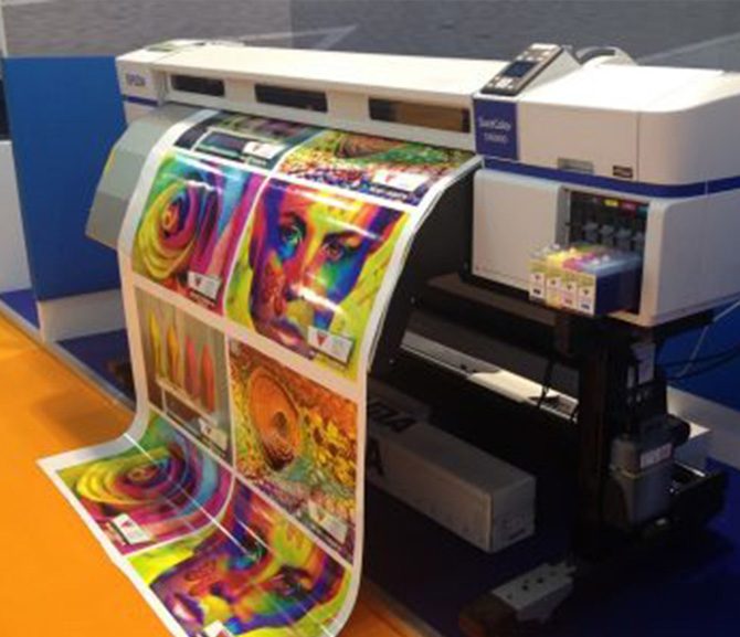
Choosing the Right Material and Printing Options
Selecting appropriate printing materials significantly impacts the durability, appearance, and overall effectiveness of your posters. Popular options include gloss, matte, and satin finishes, each offering distinct visual qualities and tactile experiences. Glossy paper enhances vibrant colors and high contrast visuals, making images pop, whereas matte provides a subdued finish that reduces glare, ideal for readability in brightly lit environments. Satin offers a balanced sheen, combining aspects of both finishes. The choice of material should align with the poster’s intended use and display setting. For outdoor applications, weather-resistant and tear-resistant materials like vinyl or laminated paper help sustain durability against environmental elements. Indoor posters may utilize standard cardstock or high-quality gloss paper for a professional presentation. Regarding printing techniques, digital printing offers quick turnaround times and high-resolution output suitable for small to medium runs. Offset printing provides cost efficiency for large quantities, ensuring consistent color quality and crisp details. UV printing is optimal for glossy finishes and adheres well to diverse substrates, while large-format inkjet printing enables the production of sizeable posters with vibrant colors. The selection of ink types, such as eco-solvent or aqueous inks, influences durability and colorfastness. Eco-solvent inks generate tough, weather-resistant prints, ideal for outdoor use, whereas aqueous inks are environmentally friendly and suitable for indoor posters. Considering the printing environment, surface texture, and color requirements will help determine the most appropriate combination. For enhanced longevity and visual appeal, many clients opt for laminated or coated finishes, protecting against scratches, smudges, and fading. Engaging with a professional printing service ensures access to a range of premium materials and finishes tailored to your project's specifications, guaranteeing a printed poster that meets high standards of quality and durability.

Understanding Poster Design Principles
Effective poster design hinges on a combination of visual impact and clear communication. The foundational principles involve balancing hierarchy, alignment, contrast, and whitespace to ensure that key messages stand out and guide viewers seamlessly across the content. When designing posters, it's essential to consider the target audience, location of display, and the core message you wish to convey. Strategic use of typography, imagery, and color schemes enhances readability and draws attention without overwhelming the viewer.
Clarity is paramount; avoiding clutter and ensuring that the main call-to-action or focal point is immediately recognizable can significantly boost engagement. Consistency in branding elements, including logos and color palettes, reinforces brand identity. Additionally, maintaining a visual balance created through appropriate spacing and alignment helps in delivering a professional look that resonates with viewers.
Furthermore, incorporating high-resolution images and vector graphics ensures that posters retain sharpness across different sizes and printing formats. Understanding the psychology of color and visual hierarchy allows designers to craft posters that evoke desired responses, whether to inform, persuade, or motivate action.

Choosing the Right Material and Printing Options
Selecting suitable materials is vital to ensure the durability and appearance of your posters. Indoor posters typically benefit from high-quality gloss or matte paper that provides vibrant color reproduction and a sleek finish. For outdoor applications, weather-resistant materials such as vinyl, polypropylene, or laminate-coated substrates are ideal, offering protection against moisture, tearing, and UV exposure.
Printing techniques should align with your project needs: digital printing excels in quick turnaround and detailed color matching, making it great for short-run or customized posters. Offset printing offers cost-effective solutions for large quantities while maintaining high quality. UV printing provides glossy finishes and adheres well to various surfaces, adding an extra layer of durability for high-traffic areas.
Finishing options like lamination, coating, or mountings further enhance the lifespan and visual appeal of your posters. Laminated surfaces resist scratches, smudges, and fading, ensuring your message remains prominent over time. Engaging a professional printing service allows you to explore premium materials and finishes, tailored specifically for your project’s environmental and display conditions.

Size and Dimensions for Posters
Choosing the appropriate size and dimensions is critical to maximizing visibility and impact. Standard poster sizes such as 18x24 inches, 24x36 inches, and larger formats like 36x48 inches are popular choices, but custom dimensions can be tailored to specific display spaces or design needs. Larger posters are more eye-catching from a distance, making them suitable for outdoor locations or large halls, while smaller sizes fit well in indoor environments like offices, retail spaces, or exhibition booths.
Consider the viewing distance when selecting dimensions—larger posters are more effective for distant viewing, whereas smaller ones can be detailed with intricate graphics and smaller fonts for close-up audiences. Additionally, aspect ratio and orientation (portrait or landscape) should complement the message's layout and the display environment.
Accurate measurements and professional layout services ensure the final product aligns with your visual and functional goals, preventing issues like cropping or insufficient margins during print production.
Design Software and Tools for Posters
Creating compelling poster designs requires robust software tools that combine ease of use with professional features. Adobe Photoshop and Illustrator are industry standards, offering extensive control over graphics, typography, and color management. For those seeking more accessible options, Adobe Spark, Canva, and CorelDRAW provide user-friendly interfaces with drag-and-drop functionality, templates, and pre-designed elements suitable for beginners and semi-professionals.
Utilizing these tools effectively involves understanding resolution requirements—normally 300 DPI for print—to ensure sharpness and clarity. Layer management, color profiles, and vector graphics facilitate flexibility and precision in design. Additionally, working with templates and custom grids can streamline the creative process, ensuring consistent output aligned with branding guidelines.
For collaborative projects, cloud-based tools allow multiple stakeholders to review and modify designs in real time, ensuring that the final product meets all expectations before printing. Investing in high-quality design software ensures you have the necessary capabilities to produce posters that are both visually striking and professionally crafted.
Legal and Copyright Considerations
When engaging in poster design and printing services, understanding the importance of respecting intellectual property rights is essential. Utilizing copyrighted images, graphics, or fonts without proper authorization can lead to complications that undermine the integrity of your promotional efforts. It is crucial to source images and design elements from reputable providers that offer licensed or royalty-free assets. Many printing services, including professional poster printing providers, can guide you toward legitimate sources for high-quality visuals, ensuring your designs remain compliant with copyright standards. Furthermore, registering your own original designs can provide added protection and establish clear ownership. Working with design professionals, whether in-house or through freelance platforms, can help you craft unique posters that reflect your brand identity while avoiding the use of unauthorized materials. Always keep documentation of any licenses or permissions obtained for images, fonts, and other design components. Adhering to these practices not only safeguards your organization against potential legal issues but also enhances your reputation for integrity and professionalism in the marketplace. When preparing artwork for printing, ensure that all elements are appropriately licensed and credited as required. This diligence helps in maintaining transparency and respect within the creative community, fostering ongoing collaborations and trust with your printing partners. In addition to respecting copyrights, consider the specific branding guidelines and messaging standards that should be consistently applied across your posters. Proper branding reinforces recognition and ensures your promotional materials accurately reflect your organization’s values and identity. By prioritizing these considerations, your poster campaigns will maintain a high standard of compliance and professionalism, ultimately contributing to their effectiveness and longevity.
Ensuring Proper Poster Distribution and Display
Strategic distribution and placement of posters are critical to maximize visibility and impact. To achieve optimal exposure, it is essential to select high-traffic locations that are relevant to your target audience, such as community centers, retail outlets, campuses, and event spaces. Gaining permission from property owners or managers before installing posters ensures a smooth process and upholds professional standards. It’s advisable to adhere to local regulations and ordinances related to outdoor advertising and posting signage, preventing potential issues or fines. Careful consideration should be given to the timing and duration of display. For instance, during targeted promotional campaigns or seasonal events, deploying posters in alignment with specific dates can enhance their relevance and engagement. Regularly monitoring poster placements helps identify signs of wear or damage, allowing timely updates or replacements to maintain a professional appearance. In indoor environments, consider the use of dedicated display boards or digital kiosks, which can be effective for lightweight or temporary advertising. Additionally, ensure posters are securely mounted using appropriate tools to prevent damage or accidental falls, which could compromise safety and aesthetics. For effective dissemination, complement poster displays with other promotional strategies such as social media sharing, email campaigns, and community outreach. This integrated approach helps amplify your message and reach a broader audience. It's important to maintain a record of placement locations and durations, especially for large-scale campaigns, to evaluate overall effectiveness and plan future initiatives more efficiently. Consistent branding elements, such as logo placement and color schemes, should be maintained across all display points to reinforce brand recognition. Proper dispensation and strategic display of posters not only enhance their visual impact but also support comprehensive marketing goals, reinforcing your organization’s presence and message in the community.