Understanding Colour Posters
Colour posters serve as a powerful visual communication tool utilized across diverse industries and settings, from marketing campaigns and product promotions to decorative displays and informational signage. Their primary characteristic is the use of vibrant, full-color imagery and text to attract attention, evoke emotions, and convey messages effectively. The strategic application of colour in posters enhances visual impact, making them an essential element in capturing audience interest and delivering information succinctly.
At their core, colour posters combine high-quality printing with dynamic visuals to create an engaging presentation that stands out in any environment. They can be tailored to suit various themes, branding guidelines, or specific campaigns, providing versatility in design and purpose. From bold, eye-catching designs meant to generate immediate interest to subtle, sophisticated compositions that aim to inform and persuade, the use of colour significantly amplifies the poster’s effectiveness.
The advantages of utilizing vivid, colour-rich posters are numerous. They enhance brand visibility, foster emotional connections with viewers, and increase the likelihood of message retention. By employing a broad spectrum of hues, designers can create visual hierarchies that guide the viewer’s eye and emphasize key information. Furthermore, the vibrancy of colour posters allows them to be used in a wide variety of environments, from indoor displays in retail locations to outdoor billboard advertising, ensuring versatility and maximum reach.
In addition to their aesthetic appeal, colour posters are also durable and capable of withstanding environmental factors when printed using appropriate materials and techniques. This makes them suitable for both temporary displays and long-term signage. As a result, they are an economical choice for organizations seeking impactful visual marketing or decorative solutions that provide sustained visibility over time.
Understanding the nature and potential applications of colour posters lays the foundation for effective design and production. By leveraging the advantages of high-quality visuals and color fidelity, businesses and individuals can craft posters that not only communicate their messages vividly but also leave a lasting impression on their target audience.
Design Principles for Colour Posters
Creating an impactful colour poster requires careful consideration of several core design principles to ensure that the message resonates with the audience while maintaining visual appeal. A well-balanced layout forms the foundation, guiding viewers seamlessly through the content. This involves strategic placement of text, images, and focal points to enhance readability and emphasis. Utilizing a grid system can assist in maintaining alignment and harmony, ensuring that each element complements the others without cluttering the overall design.
Color harmony is vital in creating a poster that is both eye-catching and coherent. Selecting a harmonious colour scheme—whether monochromatic, complementary, or analogous—can boost visual cohesion and make key messages stand out. Contrasting colours are often used to highlight critical information, such as calls to action or promotional details, ensuring they are easily noticeable among other elements.
Typography plays a crucial role in the effectiveness of colour posters. Choosing legible fonts that align with the overall theme is essential. Bold or larger typefaces are typically employed for headlines and essential messages, while supporting details can be presented with more subdued fonts. Proper spacing and font sizes contribute to clarity and prevent visual overload, making the information accessible at various viewing distances.
Effective use of imagery enhances the visual impact while supporting the underlying message. High-resolution images that resonate with the poster's theme can evoke emotions, foster connections, and increase retention. When selecting images, consider their colour palette, ensuring they complement the overall colour scheme to maintain visual balance and consistency.

By integrating these design principles—thoughtful layout, harmonious colour schemes, clear typographic choices, and compelling imagery—designers can craft colour posters that attract attention, communicate effectively, and leave a memorable impression on viewers. The synergy of these elements ensures that each poster not only looks appealing but also functions optimally in conveying its intended message.
Understanding Colour Posters
Colour posters serve as powerful visual tools for businesses, events, and campaigns, leveraging vibrant hues to capture attention and communicate messages effectively. Their ability to evoke emotions, create brand identity, and increase visibility makes them a preferred choice for promotional and informational purposes. The strategic use of colours in posters not only enhances aesthetic appeal but also influences viewer perception and behaviour. Bright, contrasting colours can stimulate excitement and urgency, while softer palettes evoke calmness and trust. Recognizing the psychological impact of colours allows designers and marketers to craft posters that resonate with the target audience and achieve specific objectives.
In addition to aesthetic considerations, the material quality and printing methods significantly affect the durability and overall impact of colour posters. Choosing high-quality substrates ensures that colours remain vibrant over time, even when exposed to environmental elements. Durable materials like weather-resistant vinyl or coated paper are ideal for outdoor displays, whereas standard poster paper suffices for indoor environments. The selection of appropriate printing techniques influences not only the visual fidelity but also the tactile quality, helping it stand out and withstand handling or exposure.
Design Principles for Colour Posters
Effective colour posters are rooted in fundamental design principles that optimize visual appeal and message clarity. The creation process begins with establishing a clear visual hierarchy, allowing viewers to naturally navigate through the information presented. Contrasting colours help highlight key messages and calls to action, ensuring they are immediately visible. Typography choice plays a crucial role in readability—bold, large fonts for headlines, and supportive, legible fonts for supplementary details. Adequate spacing prevents clutter, maintaining clarity across different viewing distances.
Imagery should be carefully selected to reinforce the message and evoke appropriate emotional responses. High-resolution images that align with the poster’s theme and colour palette contribute to a cohesive visual story. Maintaining balance between elements—text, images, and negative space—ensures the poster does not feel overwhelming. The overall colour scheme should be harmonious, drawing viewers' eyes across the entire design without causing visual fatigue. When these principles are combined intentionally, the resulting colour posters maximize their impact and effectiveness in delivering messages.
Choosing the Right Colors and Materials
Selecting colours for posters requires an understanding of colour psychology and audience preferences. Bright colours like red, orange, and yellow are energetic and attention-grabbing, suitable for sales or urgent announcements. Cooler tones, such as blue and green, foster trust and relaxation, ideal for corporate and environmental themes. Complementary colours are used to create contrast and improve readability, especially for text overlay on images or backgrounds.
Materials play a vital role in ensuring the poster's longevity and vibrancy. For outdoor applications, weather-resistant substrates such as vinyl or laminated paper are recommended to withstand moisture, sunlight, and wind. Indoor posters can utilize high-quality coated paper that offers sharp colour reproduction and a professional finish. Consideration of the material’s finish—glossy or matte—also impacts visual appearance and glare reduction, enhancing the viewer's experience.

By thoughtfully integrating colour theory and selecting suitable materials, designers can produce posters that not only attract attention but also endure in various display environments, maintaining their vibrancy and clarity throughout their lifespan.
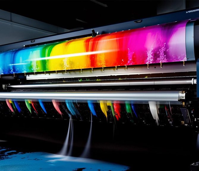
Optimizing Printing Methods for Exceptional Colour Posters
Choosing the appropriate printing technique is crucial for achieving vibrant, durable, and visually appealing colour posters that effectively communicate your message. Each method offers distinct advantages suited to specific needs and production scales, ensuring your posters maintain their integrity over time and in various environments.
Digital Printing
Digital printing is renowned for its speed, affordability, and suitability for small to medium-sized runs. It allows for high-resolution images and detailed colour output, making it ideal for customized posters, short-term campaigns, or prototypes. Digital presses can reproduce complex images with subtle colour gradations, capturing intricate designs without the need for extensive setup. This technique also facilitates quick revisions and updates, a critical feature for campaigns requiring frequent changes.
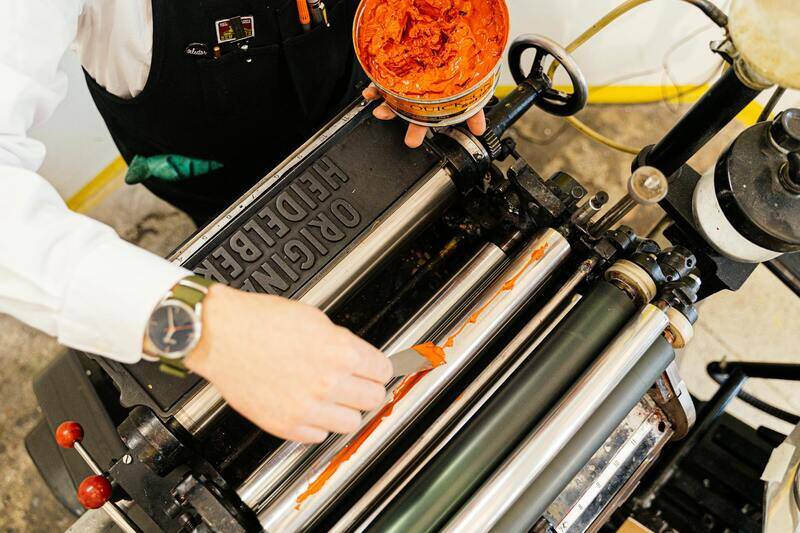
Offset Printing
Offset printing remains the preferred choice for high-volume production due to its cost efficiency and excellent colour consistency. Particularly effective for large batches, it delivers sharp detail and vibrant colours through precise colour layering. Offset presses utilize plates to transfer ink onto a rubber blanket, which then presses onto the printing substrate. The result is a uniform finish, especially with premium gloss or matte papers, enhancing the visual impact of colour posters intended for extensive display in outdoor or indoor venues.
Large-Format Printing
For posters that demand size and visibility, large-format printing offers remarkable versatility. This method employs special printers capable of producing banners, billboards, and oversized displays with seamless quality. It supports a variety of materials, including vinyl, fabric, and backlit films, providing flexibility in application. Large-format printing often utilizes solvent or UV inks, which are resistant to fading, moisture, and harsh weather conditions, ensuring longevity and vibrant colour retention even in outdoor settings.

Choosing the proper printing technique hinges on a comprehensive assessment of your project scope, desired lifespan, budget constraints, and environmental factors. For short-term or promotional visuals, digital printing delivers quick turnaround and customization. When producing large quantities of high-quality posters, offset printing offers remarkable precision and economy. For expansive displays or outdoor signage, large-format printing ensures size without sacrificing detail or durability.
By leveraging the strengths of each printing technology, designers and businesses can produce colour posters that not only capture attention but also resist wear and environmental influences, maintaining their vibrancy and clarity throughout their display lifespan. Engaging with a reputable printing provider ensures access to advanced equipment and expert guidance, optimizing the final product for maximum impact.
Understanding Colour Posters
Colour posters serve as dynamic visual communication tools that captivate audiences through vibrant imagery and compelling messaging. Their ability to attract attention hinges on strategic use of colours, effective design, and high-quality printing techniques. These posters are employed across various settings, from retail outlets and corporate events to public spaces and special promotions, making them invaluable for conveying powerful messages quickly and efficiently. When selecting or creating colour posters, it’s essential to consider the impact of colour psychology, contrast, and layout to ensure the visual elements work harmoniously to reinforce the intended message.

Design Principles for Colour Posters
Effective colour poster design begins with clear objectives. Determine the message you want to convey and identify the target audience. Incorporate foundational design principles such as hierarchy, balance, and alignment to ensure the content is visually accessible. Use contrast strategically to highlight key information or call-to-actions, guiding viewers' eyes through the poster seamlessly. Limit clutter by maintaining a clean layout, allowing the colours and images to stand out without overwhelming the viewer.
Utilize colour theory to select harmonious or contrasting palettes that evoke the desired emotional responses. For instance, warm colours like reds and oranges create a sense of urgency and excitement, making them ideal for promotions or clearance sales. Cooler tones like blues and greens foster trust and calmness, suitable for corporate or health-related messaging. Typography should complement the colour scheme—bold fonts for headlines and more subdued styles for details—to foster readability and visual appeal.
Consistency in colour usage throughout the poster reinforces branding elements and helps establish visual identity. Avoid overusing bright or clashing colours, which can dilute the message or cause visual fatigue. Prioritize simplicity and clarity—each element should serve a purpose, contributing to a cohesive and impactful overall design.
Choosing the Right Colors and Materials
The selection of colours and materials greatly influences both the aesthetic quality and durability of your colour posters. When choosing colours, consider the context in which the poster will be displayed. Bright, high-saturation hues tend to be highly visible outdoors, even from a distance, making them excellent for outdoor advertising. Conversely, more subtle or pastel tones can be suitable for indoor environments where understated elegance is desired.
Material choice impacts the poster’s lifespan and resilience. Vinyl banners and weather-resistant fabrics are optimal for outdoor use, withstanding moisture, wind, and UV exposure while maintaining vibrancy. For indoor displays, heavyweight paper or coated card stock offers sharp image quality and ease of handling. Backlit films and translucent materials can add an extra dimension, especially for window displays or illuminated environments, enhancing colour vibrancy at night or in dim lighting.
Printing Techniques for Colour Posters
Optimal printing methods ensure that the poster’s colours are reproduced accurately and consistently. Digital printing is widely used for short runs or customized banners because of its rapid turnaround and high-quality output. It can produce detailed, vibrant images with a broad colour gamut, making it ideal for small to medium-sized runs where precision matters.
Offset printing offers economical solutions for bulk production, providing sharp image quality and consistent colour accuracy, especially in large quantities. This technique uses plates to transfer ink onto the printing surface, allowing for precise colour matching and fine detail reproduction, which is vital for brand consistency.
Large-format or wide-format printing technology is tailored for oversized posters and banners. This process employs specialized printers capable of handling expansive materials without sacrificing clarity or colour fidelity. Often utilizing solvent or UV inks, these prints are resistant to fading, moisture, and environmental conditions, ensuring the durability required for outdoor or long-term displays.
In choosing the appropriate printing method, consider factors such as budget, quantity, desired longevity, and display environment. Engaging a professional printing provider can help determine the best approach to meet your visual and functional needs, ensuring your colour posters deliver maximum impact over time.
Understanding Colour Posters
Colour posters serve as powerful tools for marketing, branding, and communication, harnessing vibrant visuals to attract attention and convey messages effectively. They are versatile, suitable for a range of environments from indoor displays in retail stores to outdoor advertising campaigns. The use of colour in posters is not just aesthetic; it strategically influences emotions and perceptions, making it essential to select the right hues and materials for specific objectives.

Achieving high-quality colour posters involves a thorough understanding of design, printing techniques, and material selection. Vibrant, well-printed posters not only boost visibility but also reinforce brand identity, making your message memorable. Proper planning ensures that every poster produced is visually compelling, durable, and suited for its intended environment.
Design Principles for Colour Posters
Effective colour posters are crafted with a balanced approach to layout, contrast, and colour harmony. When designing, consider the following principles:
- Contrast: Use contrasting colours to highlight important information or focal points, enhancing readability and visual impact.
- Color Harmony: Select colours that complement each other, creating a cohesive look that appeals to the viewer’s senses.
- Minimalism: Avoid clutter by focusing on key messages and using clean, simple designs that facilitate quick understanding.
- Typography: Pair colours with appropriate font styles and sizes, ensuring text stands out clearly against background hues.
- Visual Hierarchy: Structure elements so that the most important information commands attention first, guiding the viewer’s eye naturally across the poster.
Incorporating these principles during the planning phase of your poster design ensures the visual appeal and functionality are maximized. Properly executed designs can lead to increased engagement, better brand recall, and ultimately, a more successful promotional effort.
Choosing the Right Colors and Materials
The selection of colours should align with your branding goals, target audience, and the message you want to communicate. Bright, saturated colours tend to attract immediate attention, making them suitable for sales or grand openings, while softer, subdued tones can convey elegance or professionalism.
Material choice is equally important, impacting durability and appearance:
- Glossy Paper: Enhances vibrancy and image sharpness, ideal for indoor displays where glare isn’t an issue.
- Matte Finish: Reduces reflections and provides a sophisticated look, suitable for environments with bright lighting.
- Vinyl or Weatherproof Materials: Designed for outdoor use, these materials resist water, UV rays, and environmental wear, ensuring longevity in various weather conditions.
- Textured Surfaces: Add tactile interest and depth to your posters, making them stand out even further.
Considering the environment where the posters will be displayed and the lifespan you expect helps determine the most suitable combinations of colours and materials. Partnering with a professional printer can guide you in making choices that optimize visual impact, durability, and cost-efficiency.
Care, Maintenance, and Longevity of Colour Posters
Ensuring your colour posters maintain their vibrant appearance and structural integrity over time requires a combination of proper care, strategic placement, and environmental considerations. Whether posters are used for indoor branding or outdoor promotion, understanding how to preserve their quality extends their lifespan and preserves the intended visual impact.
Handling and Installation
When installing or handling colour posters, use clean hands or gloves to prevent oils and dirt from contaminating the surface. Avoid excessive bending or folding, which can cause cracks or creases in the material. During installation, ensure that mounting surfaces are clean, dry, and free from dust or grease that could compromise adhesion or cause uneven wear.
Cleaning and Maintenance
- Regular dusting: Use a soft, dry cloth or a gentle brush to remove dust and loose debris from the poster surface, especially in indoor environments where dust accumulation is common.
- Spot cleaning: For smudges or stains, lightly dampen a microfiber cloth with water or a mild, non-abrasive cleaning solution. Gently wipe the affected area, avoiding excessive rubbing to prevent ink damage or surface abrasions.
- Protection from moisture: Keep posters dry in indoor settings, and in outdoor environments, ensure they are mounted on waterproof materials or under protective coverings to prevent water ingress, which can lead to fading or peeling.
- Avoid harsh chemicals: Stay clear of abrasive cleaners, solvents, or bleaches that may degrade inks or materials, compromising colour vibrancy and adhesion.
Environmental Factors Impacting Longevity
The environment where posters are displayed significantly influences their lifespan. Outdoor posters are exposed to UV radiation, moisture, wind, and temperature fluctuations. Using weather-resistant materials like vinyl or coated fabrics enhances durability against such elements. For indoor posters, controlling humidity and avoiding direct sunlight helps prevent fading and discoloration.
Protective Measures and Enhancements
- Laminations: Applying a clear laminate layer provides an additional safeguard against scratches, fading, and moisture. Glossy laminates amplify colours' vibrancy, while matte finishes reduce reflections and glare.
- Framing: Framing not only enhances visual appeal but also offers physical protection from accidental tears or damage.
- Placement considerations: Position posters away from direct sunlight, heat sources, or moisture-prone areas to minimize deterioration over time.
Long-Term Storage and Transition
If posters need to be stored temporarily or reused for future campaigns, keep them in a cool, dry, and dark environment. Roll posters carefully with the printed side outward and place them in protective tubes or sleeves. Avoid folding or stacking to prevent creases and surface scuffs.
Comprehensive Techniques for Creating and Displaying Colour Posters
Optimizing Visual Impact through Placement and Display Strategies
Effective placement is crucial to maximize the visibility and impact of colour posters. When considering where to display your posters, focus on high-traffic areas where your target audience is most likely to see them. Strategically placing posters at eye level ensures natural viewing, drawing attention without distraction. For outdoor displays, selecting locations sheltered from direct sunlight and harsh weather conditions extends the lifespan and maintains colour vibrancy.
Lighting plays a significant role in how colours appear, so consider positioning posters in well-lit environments to enhance their visual appeal. Avoid glare and reflections that can obscure details; using matte finishes and anti-glare coatings can mitigate these issues. When installing, ensure posters are securely affixed using appropriate mounting methods to prevent sagging, tearing, or curling over time.
Protective Measures and Long-Term Preservation
Protecting your colour posters from environmental damage is vital for longevity and consistent quality. Lamination offers a transparent barrier that shields against scratches, moisture, and fading, especially in high-traffic or outdoor settings. Glossy laminates amplify colour intensity, making visuals more striking, while matte finishes help reduce unwanted reflections and glare.
Encasing posters in frames adds an extra layer of protection and can elevate their professional appearance. Frames guard against physical damage such as tears or creases and make hanging easier. For posters displayed in outdoor environments, weather-resistant framing or mounting options can significantly extend their durability.
Proper storage techniques when posters are not on display further preserve their condition. Roll posters carefully with printed side outward, placing them in protective tubes or sleeves to prevent creasing or surface abrasions. Important considerations include storing in cool, dry, and dark conditions, avoiding exposure to excessive humidity or temperature fluctuations that may cause warping or fading over time.
Maintenance Tips for Preserving Colour Vibrancy
- Regularly clean posters with a soft, damp cloth to remove dust and dirt without damaging the surface or colours.
- Avoid using harsh cleaning agents or abrasive materials that could degrade ink or surface coatings.
- Inspect for signs of damage periodically and address issues promptly to prevent further deterioration.
- Ensure outdoor posters are regularly checked for weather-related wear, and consider reapplying protective coatings as needed.
- Maintain optimal environmental conditions in storage, avoiding excessive humidity or direct sunlight to prevent fading.
By combining strategic placement, protective enhancements, and proper maintenance, the lifespan of colour posters can be significantly extended. This ensures that visual messaging remains vibrant, effective, and engaging over time, providing ongoing value for your branding and promotional efforts.